Puck: A Premium Display Font for Mystical Digital Branding
As a web designer who builds landing pages, SaaS dashboards, and boutique e-commerce experiences, I’m constantly balancing personality with performance. That’s why Puck stands out—not as another decorative novelty, but as a purpose-built display font that delivers depth, clarity, and tonal consistency across digital touchpoints. It’s not just beautiful; it’s engineered for impact in real layouts.
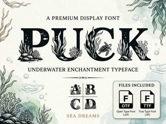
Puck belongs to the display category—designed explicitly for headlines, hero titles, and high-visibility moments where typography must carry emotional weight. Its bold, classic structure is softened by subtle aquatic rhythm: gentle curves, balanced counters, and a quiet confidence in stroke contrast. It evokes serenity without sacrificing presence—ideal for brands rooted in wellness, ocean conservation, mindful tech, or creative retreats. Unlike overly ornate script fonts or brittle geometric displays, Puck holds up at scale on retina screens, maintains legibility over image overlays, and avoids visual fatigue in short bursts of text.
Where Puck Earns Its Place in Your Layout
You won’t use Puck for body copy—and that’s intentional. Its strength lies in strategic emphasis: hero section headlines, product name treatments, course title cards, newsletter banners, and branded CTA buttons. On a coaching website, Puck sets the tone before a single sentence loads—its calm authority signals trust and intentionality. In an online shop for sustainable swimwear, it transforms “Tide Collection” from a label into a mood. For a digital art portfolio, pairing Puck with a neutral sans serif (like Inter or Manrope) creates instant hierarchy: the display font commands attention, while the supporting type ensures scannability and accessibility.
It performs especially well in conversion-focused zones. On a course sales page, “Enroll Now” in Puck—set slightly larger than surrounding text, with generous letter-spacing—feels like an invitation rather than a demand. On mobile, keep usage concise: limit Puck to one line per screen (e.g., “Deep Focus. Real Results.”), and always test contrast against background gradients or photos. At 32–48px on desktop and 24–36px on mobile, it remains crisp—even on OLED displays.
Readability & Responsiveness: Practical Considerations
Puck isn’t meant for paragraphs—but it *is* built for readability where it matters most. Its open apertures and generous x-height support quick scanning in hero sections and email headers. When layered over imagery, use a subtle semi-transparent overlay or text shadow (1px black at 30% opacity) to preserve contrast on light and dark backgrounds alike. Avoid placing Puck directly over busy textures or low-saturation blues—it thrives against clean whites, deep navy, soft greys, or muted seafoam tones.
On dark mode interfaces, Puck gains even more presence. Its weight and spacing hold up beautifully against charcoal or slate backgrounds—no need to switch to a lighter weight. Just ensure your CSS declares font-display: swap for fast loading, and serve WOFF2 files for optimal compression. The font includes standard Latin character sets and supports basic diacritics—sufficient for English, Spanish, French, and German web projects—but verify multilingual needs early if targeting broader European markets.
Smart Pairings for Digital Harmony
A great display font only shines when paired thoughtfully. With Puck, lean into contrast—not competition. Pair it with a humanist sans serif (like Lato or Nunito) for friendly, approachable interfaces—or a restrained geometric sans (like IBM Plex Sans) for tech-forward clarity. For editorial-style blogs or brand storytelling sites, try a warm, low-contrast serif (such as Cormorant Garamond) in body copy to echo Puck’s classical roots while keeping reading effortless.
Avoid pairing Puck with other display fonts, heavy scripts, or ultra-thin weights. Its personality is strong enough to anchor a layout—don’t dilute it. In Figma or Adobe XD, build reusable text styles: “H1 – Puck Bold, 48px, tracking +40” and “Body – Inter Regular, 18px, line-height 1.6”. Consistency here reinforces brand identity across every screen—from homepage to 404 page.
Licensing & Real-World Usage
Puck is a commercial font, and licensing matters—especially when shipping design systems to clients or embedding in SaaS products. Most licenses cover web use via @font-face (with proper domain restrictions), desktop use for design work, and even limited use in social media graphics and digital ads. If you’re selling templates on ThemeForest or building white-labeled dashboards, confirm whether your license permits redistribution or client handoff. Never self-host a font without verifying the EULA—many premium fonts restrict usage to specific domains or require annual renewals for active sites.
In practice, Puck fits seamlessly into modern frontend workflows. Load it via Google Fonts (if available) or host it locally using @import or with fallbacks. Always declare a system font stack in your CSS: font-family: "Puck", -apple-system, BlinkMacSystemFont, "Segoe UI", sans-serif;. This ensures graceful degradation if the font fails to load—critical for performance-conscious designers.
Final Layout Notes
Use Puck for: hero titles, section headers, logo lockups (when text-based), testimonial quotes, pricing plan names, and banner headlines. Avoid it for navigation menus, form labels, small CTAs under 16px, or long-form headings with more than six words. Its magic lives in restraint—in giving users one clear, resonant impression before they scroll.
Whether you're launching a meditation app, redesigning a coastal boutique’s Shopify store, or crafting a brand kit for a marine science nonprofit, Puck adds dimension without distraction. It doesn’t shout. It settles in—deep, calm, and unmistakably intentional. And in today’s oversaturated digital landscape, that kind of quiet confidence is rare, valuable, and deeply effective.